Analytics Tab
|
|
|


This is an add-on feature. Please get in touch with your CS SPOC to enable the same for your account.
Dropthought’s Analytics tab displays text analysis of responses from open-ended questions.
You can select an open-ended question to view its categories and sentiments received for each category. They can view the overall sentiment analysis considering all open-ended questions together or sentiment analysis separately for each single open-ended question.
This article will help you understand:
How do you read the details shown in the tab?
What are the various correlation stats shown in the tab?
Function |
|---|
Total Processed Feedback: displays the number of feedback processed for the selected duration and question. You are doing best in: displays the category with the most positive sentiment. You need to improve most in: displays the category with the lowest negative sentiment. **If two categories have received the same sentiment percentage, the one mentioned in most of the responses will be given prominence.
|
The three circles displays the sentiment distribution of the selected question and duration.
|
Categories Mentioned Overtime
The section displays all the categories mentioned for the selected question duration of the program. It is displayed with the date on the X-axis and the number of processed feedback on that particular day on the Y-axis.
The line graph depicts the category's feedback count for a specific day.
Users can hover over to view the date, number of mentions, and sentiment details.
Click on the legends below the graph to select or de-select a category. The ones that are not selected will be greyed out.
Category-wise percentage breakdown of feedback sentiments
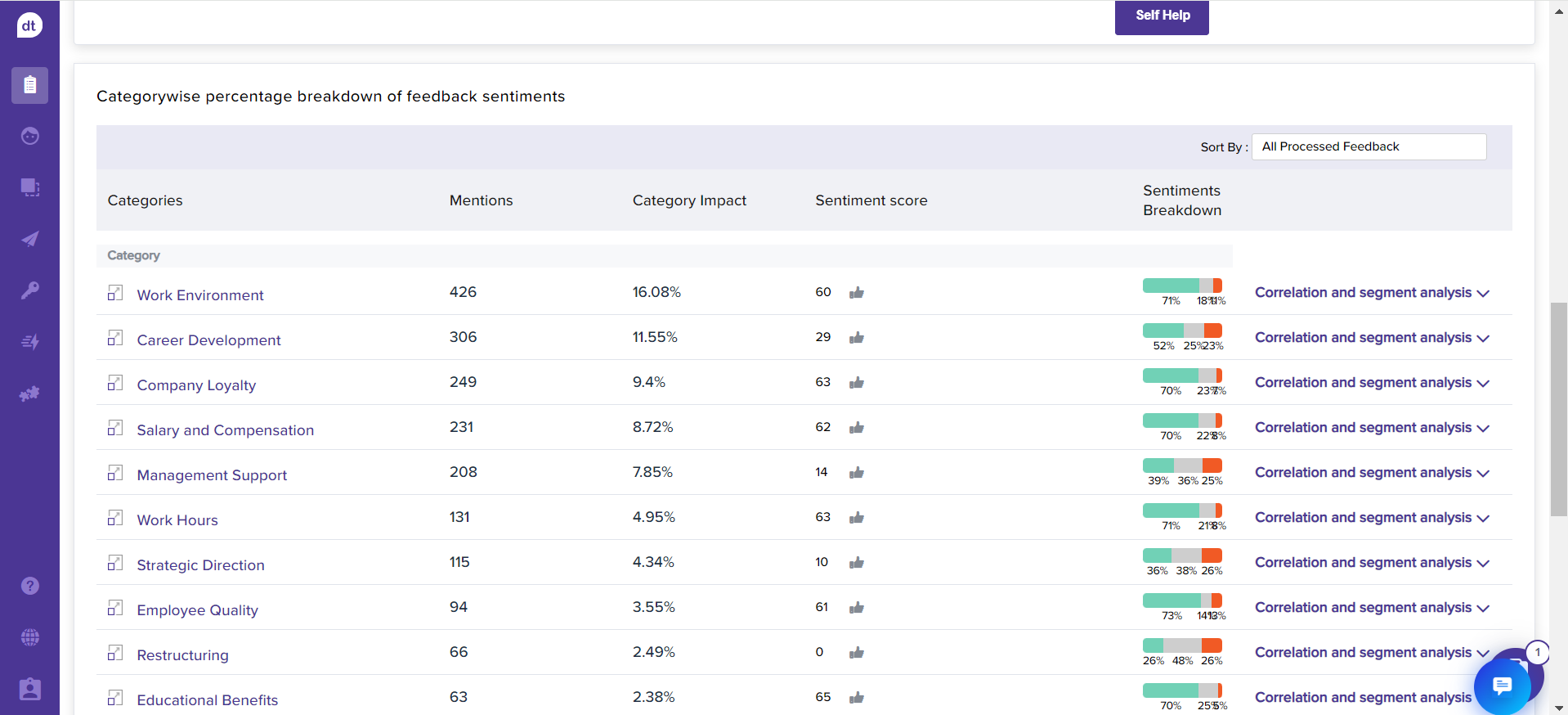
The section displays the categories mentioned for the selected question and the duration of the program:
Mentions: No. of times the respective category was mentioned in the responses
Category Impact: The impact percentage of each category is based on the total processed feedback. i.e., Impact Percentage= Total number of mentions*100/Total number of processed feedbacks.
Sentiment Score: % of positive feedback - % of negative feedback
Sentiments Breakdown: The sentiment percentage breakdown w.r.t. NPS of preferred metric.
Correlation and segment analysis:
Sentiment score based on the number of mentions from the related number of responses received.
NPS: rating received for the particular category
The graph displays the Date on the X-axis and the number of processed feedback on that day with the respective category name on the Y-axis.
Segment doing great at <selected category>: displays the top three segments where the respective category has received the most positive sentiment score based on the mentions from the total responses with the category.
Segment not doing great at <selected category>: displays the top three segments where the respective category has received the most negative sentiment score based on the mentions from the total responses with the category.
There might be “Uncategorized” categories. These are mostly those that don’t belong to any other prominent categories.
To ensure that you can view relevant details, “Uncategorized” will always be pinned to the end of the list, even if you have sorted the view using “Sort by.”
Breakdown |
|---|
Categories, Mentions, Category Impact, Sentiment Scores, Sentiment Breakdown 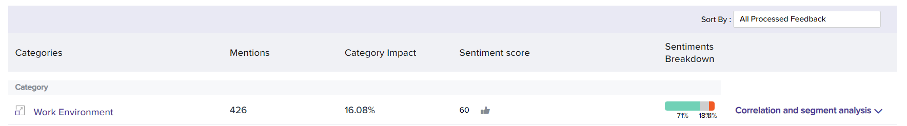 |
Click on the Category name to view all the responses received mentioning the respective category. The pop-up also displays the total responses with the category mentioned and NPS. |
Click on the sentiment percentage breakdown (positive/negative/neutral) to view all the responses where it are positive/negative/neutral based on the selection. The pop-up also displays the total responses for the percentage count and NPS. |
Correlation and Segment Analysis: Sentiment score, percentage breakdown, considered number of mentions, respondents, and NPS rating |
Correlation and Sentiment Analysis: Graphical representation of the category, date of logging the response, total number of feedback received on the respective date, number of mentions, and sentiment percentage. It can be viewed on a Daily/Weekly/Monthly basis.
|
Segment doing great at <selected category>: Click on the respondents count to view their responses.
|
Segment not doing great at <selected category>: Click on the respondents count to view their responses. |